CULTURE
Designed to be seen
By Sebastian, Founder · 28 January 2026 · 5 min read

Most supplements are designed to be tolerated. Loud labels, clinical typography, plastic that looks like it came from a dispensary. The unspoken message is that the product is a means to an end, and the sooner you can put it away the better.
We took the opposite view. If something is meant to be part of your day, every day, it should be able to sit out in the open.
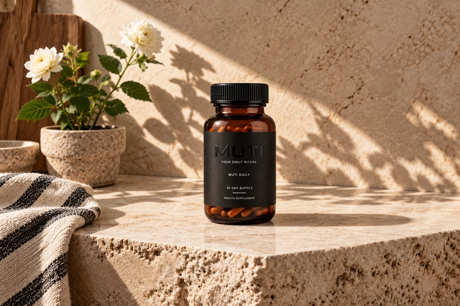
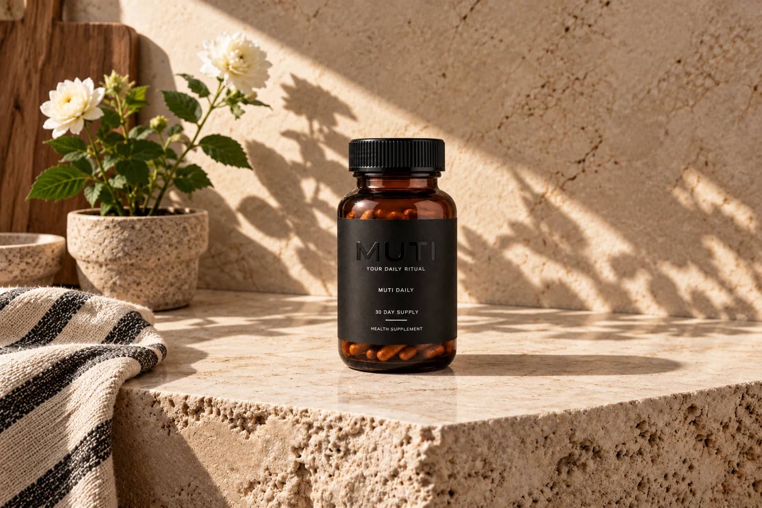
That is why MUTI pairs amber glass with a charcoal label and a tonal wordmark. From across a room it reads as one object. Up close, when the light moves across it, the detail arrives. It behaves the way good design behaves: quietly, and then all at once.
There is a practical argument here too. Things you can see are things you remember. A bottle on the counter is a cue. A bottle hidden in a cupboard is a chore.
Design is not the decoration on top of the habit. Very often, design is the habit.
Written by Sebastian, founder of MUTI. This journal is about habits, design and how to read the supplement industry. It is not health, nutritional or medical advice, and it makes no claims about what any supplement does. Speak to a healthcare professional about your own circumstances.